Have the AI visualize the composition of each variable to check the structure of the data
Copyright © 2026GotoAI Inc.Based on the goose project
The steps on this page were verified in the following environment.
- Kari: version 0.7.3, Windows
- AI provider: OpenAI ChatGPT subscription
- Model: GPT-6.1 Sol High
About this page
On the previous page, the raw CSV became a Table of 207,636 rows and 28 columns, and each column was given a type. However, we still do not know what each column contains and how much of it — in other words, the structure of the data.
Before getting into the analysis, these are the points to check.
- Which columns hold only one value and are unusable for analysis
- Which columns duplicate each other's contents, so that one of the pair is enough
- Which columns have a large share of Null
- Where the values of continuous numeric columns are concentrated
To find this out, you would aggregate the 28 columns one at a time and look at their distributions. Category columns need counts per value, and numeric columns need breakpoints to divide them into classes; by hand this takes considerable time.
With a Kari Dataflow, you can hand this aggregation to the AI in one go. A Dataflow is a unit of processing that takes Tables as input and produces a new aggregated result. The original Table is not changed. The aggregated result can be turned straight into a Chart, and the processing is kept as a Python script.
Preparing the work
-
Confirm that 「データコレクション1:不動産価格.csv:テーブル1」 (Data Collection 1 : real estate prices CSV : Table 1), created on the previous page, is registered in the Data Collection.
-
Open a chat session. Creating a Dataflow starts from an instruction in the chat, not from an operation in the tree on the left.
Instruct the AI
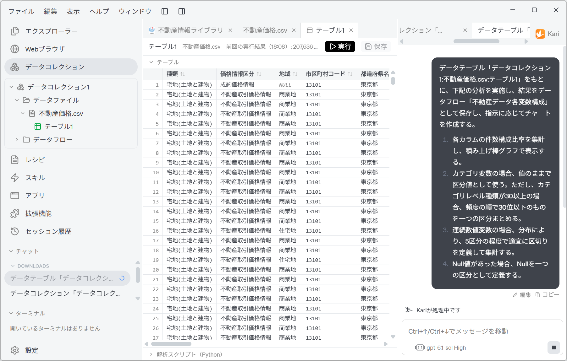
- Put together the target Table, the name of the Dataflow to save, and the aggregation rules, and instruct the AI as follows. The prompt below is an English rendering of the Japanese prompt shown in the screenshot; the Table and Dataflow names are quoted as they appear in the Japanese source.
Based on the data table 「データコレクション1:不動産価格.csv:テーブル1」, carry out the analysis below, save the result as the Dataflow 「不動産データ各変数構成」 (composition of each variable in the real estate data), and create charts as instructed.

1. Aggregate the share of record counts for each column and display it as a stacked bar chart.
2. For a categorical variable, use the values as they are as the classes. However, if there are 30 or more category levels, group those ranked 30th or lower by frequency into one class.
3. For a continuous numeric variable, define breakpoints as appropriate according to the distribution, at around 5 classes, and aggregate.
4. Where there are Null values, define Null as a class of its own.
Screenshot shown in the original Japanese.
The way this instruction is put together has a few key points.
| Block of the instruction | What it is for |
|---|---|
| Specifying the target Table | Identifies the input uniquely in the form collection name:file name:Table name. This prevents mix-ups when there are several Data Files. |
| Specifying the Dataflow name | Has the AI save the aggregated result under a name. Without a name, you will not be able to tell later what was aggregated. |
| 1. The aggregation and the chart form | Specifies "share of record counts" and "stacked bar chart". If the vertical-axis unit differs from column to column, they cannot be laid out in one chart, so aligning them as shares is the premise. |
| 2. The cap on categories | Too many classes make the chart unreadable. The cap of 30 kinds, and what to do when it is exceeded (group the less frequent ones), are decided in advance. |
| 3. Numeric breakpoints | "According to the distribution" and "as appropriate" leave room, delegating the choice of breakpoints to the AI. Only the granularity, "around 5 classes", is fixed. |
| 4. Handling Null | An important specification in this example. If Null is excluded from the aggregation, a column with many missing values looks like a "clean column". Counting Null as a class of its own makes missing values show up on the chart. |
In a composition chart, how Null is handled changes the picture dramatically. If you do not write it into the instruction, Null may be excluded or dropped as blank. If your aim is to know the state of missing values, always spell it out.
Check the AI's work
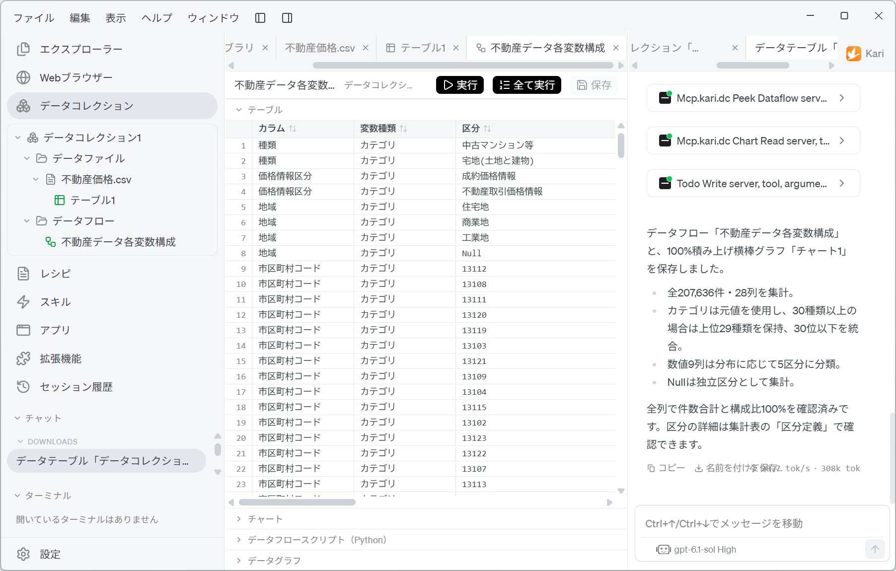
- The AI writes an aggregation script, runs it and reports the result. 「不動産データ各変数構成」 appears under Dataflow in the tree on the left.
Screenshot shown in the original Japanese.
In this example, the AI reported the following.
- It saved the Dataflow 「不動産データ各変数構成」 and a 100% stacked horizontal bar chart, 「チャート1」 (Chart 1).
- It aggregated all 207,636 records and 28 columns.
- For categories it used the original values, and where there were 30 or more kinds it kept the top 29 and merged those ranked 30th or lower.
- It divided the 9 numeric columns into 5 classes according to their distributions.
- It aggregated Null as an independent class.
- It confirmed for every column that the record counts add up and the shares come to 100%.
The instruction said "group those ranked 30th or lower into one class". The AI's report says "kept the top 29, merged those ranked 30th or lower". In other words, the 29 kinds kept plus the 1 merged class fit within 30 classes in total. The wording of the instruction could also be read as "group everything from 30th down, making 31 classes", so you need to read the report to confirm which interpretation the AI adopted.
- Under Table, the aggregated result is output as 341 rows. With the columns 「カラム」 (column), 「変数種類」 (variable kind), 「区分」 (class), 「件数」 (count), 「構成比」 (share), 「総件数」 (total count) and 「カラム順」 (column order), you can follow row by row which column was divided into which classes and how many records each had.
| カラム | 変数種類 | 区分 | 件数 | 構成比 | 総件数 |
|---|---|---|---|---|---|
| 種類 (type) | カテゴリ (category) | 中古マンション等 (second-hand condominiums) | 158,712 | 0.7643761197480206 | 207,636 |
| 種類 | カテゴリ | 宅地(土地と建物) (residential land (land and building)) | 207,636 | ||
| 価格情報区分 (price information category) | カテゴリ | 成約価格情報 (closed-sale price information) | 207,636 | ||
| 価格情報区分 | カテゴリ | 不動産取引価格情報 (real estate transaction price information) | 207,636 | ||
| 地域 (district type) | カテゴリ | 住宅地 (residential area) | 207,636 | ||
| 地域 | カテゴリ | 商業地 (commercial area) | 207,636 | ||
| 地域 | カテゴリ | 工業地 (industrial area) | 207,636 | ||
| 地域 | カテゴリ | Null | 207,636 |
-
「構成比」 (share) is kept unrounded, as in
0.7643761197480206. The chart labels are rounded for readability, so if you quote figures in a document, take them from this aggregation table. -
Note also that the 「総件数」 (total count) column is 207,636 on every row. Whichever column is being aggregated, the base is the same as the original Table, and this column lets you confirm that no particular column has had its scope narrowed.
-
Note too that 「地域」 has a Null row. Point 4 of the instruction has taken effect, and missing values are aggregated as a class of their own.
Grasp the structure with the Chart
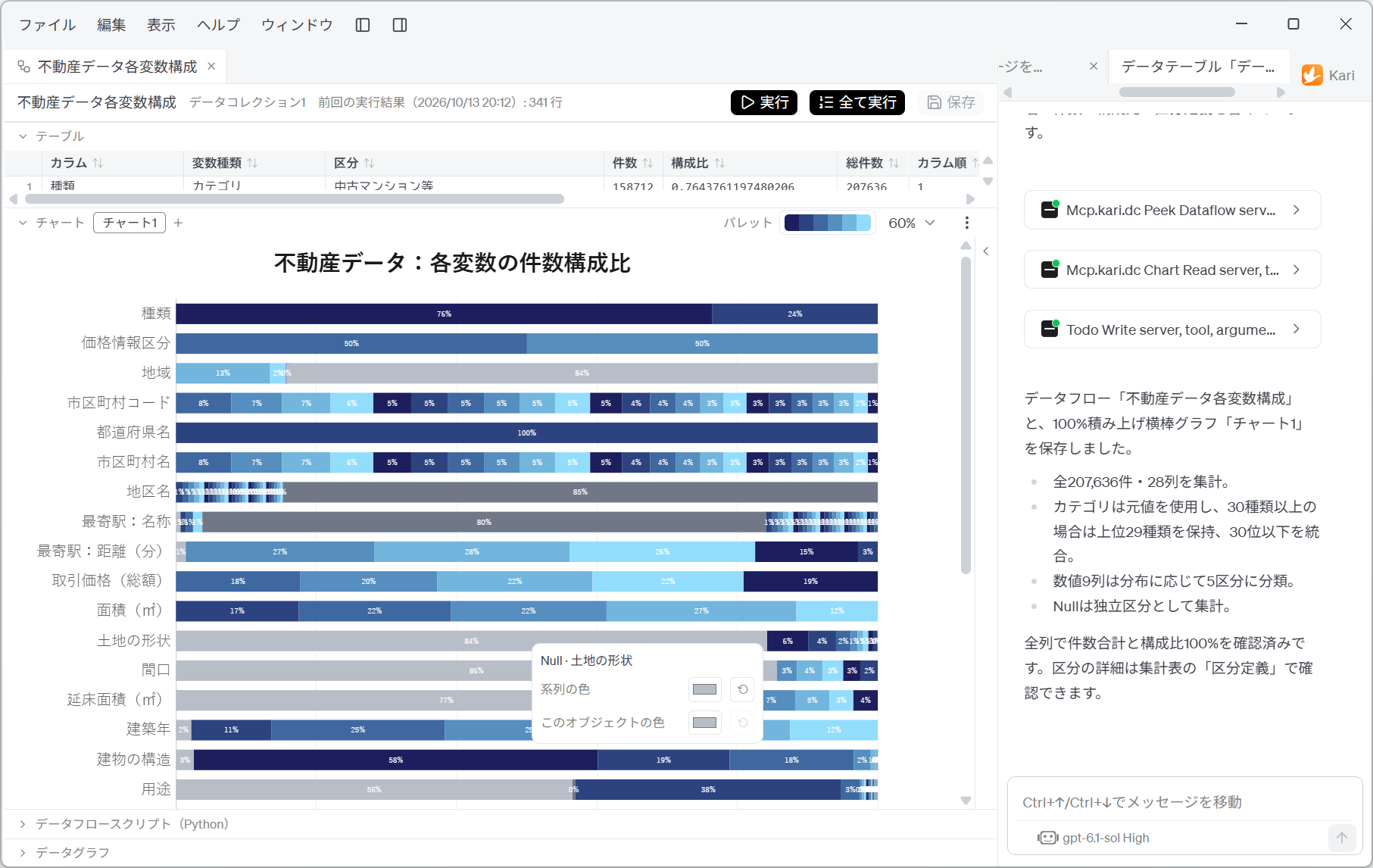
- Open Chart, and a single 100% stacked horizontal bar chart is shown. All 28 columns are lined up vertically, and each row's breakdown appears as bands, one per class.
Screenshot shown in the original Japanese.
Each band shows its share. Since every row always comes to 100%, columns can be laid side by side and compared on the same scale even when their record counts differ in magnitude.
From this single chart, you can read the following.
| What you can read | How it looks on the chart | Effect on the analysis |
|---|---|---|
| 「都道府県名」 (prefecture name) has only one value | The band is not divided; it is a single bar at 100% | Natural, since only Tokyo data was retrieved, but this column is unusable for analysis. It can serve neither as an axis of comparison nor as a variable in a correlation. |
| 「市区町村コード」 (municipality code) and 「市区町村名」 (municipality name) have the same structure | The sequence of bands in the two rows matches exactly (8%, 7%, 7%, 6%, 5%…) | They are different expressions of the same information. One of them is enough. Putting both in as variables makes them count twice in a correlation analysis. |
| 「種類」 (type) is skewed towards second-hand condominiums | Two classes, 76% and 24% | Three quarters of the population is second-hand condominiums. The overall trend is essentially the trend for second-hand condominiums. Judge whether you need analysis split by type. |
| 「価格情報区分」 (price information category) is about half and half | 50% and 50% | Closed-sale price information and real estate transaction price information are present in similar amounts. Because prices from different sources are mixed, you need to judge whether it is acceptable to average them without distinguishing the two. |
| Some columns are mostly missing | Grey bands spread wide (地域 (district type) 84%, 土地の形状 (land shape) 84%, 間口 (frontage) 86%, 延床面積(㎡) (total floor area (m²)) 77%) | These columns have values only in some of the records. Using them as conditions or variables narrows the scope considerably. |
| 「地区名」 (district name) and 「最寄駅:名称」 (nearest station: name) have very many classes | Many thin bands, plus one large band at 85% / 80% | These columns hit the 30-class cap. The one large band is either the class grouping the less frequent values or Null. The chart cannot tell you which, so check in the aggregation table (see "Human-in-the-loop points" below). |
| Continuous numeric columns are split almost evenly into 5 classes | 取引価格(総額) (transaction price (total)) at 18%, 20%, 22%, 22%, 19%; 面積(㎡) (area (m²)) at 17%, 22%, 22%, 27%, 12% | This shows that they were divided at quantiles. Note that the division is by rank, not by the size of the values. |
The purpose of this kind of chart is not to read values but to find structure. If you can identify "unusable columns", "duplicate columns" and "columns with many missing values" before the analysis, you can cut down on wasted attempts in the hypothesis testing that follows. When you need individual figures, refer to the aggregation table under Table.
Check the script and the flow of data
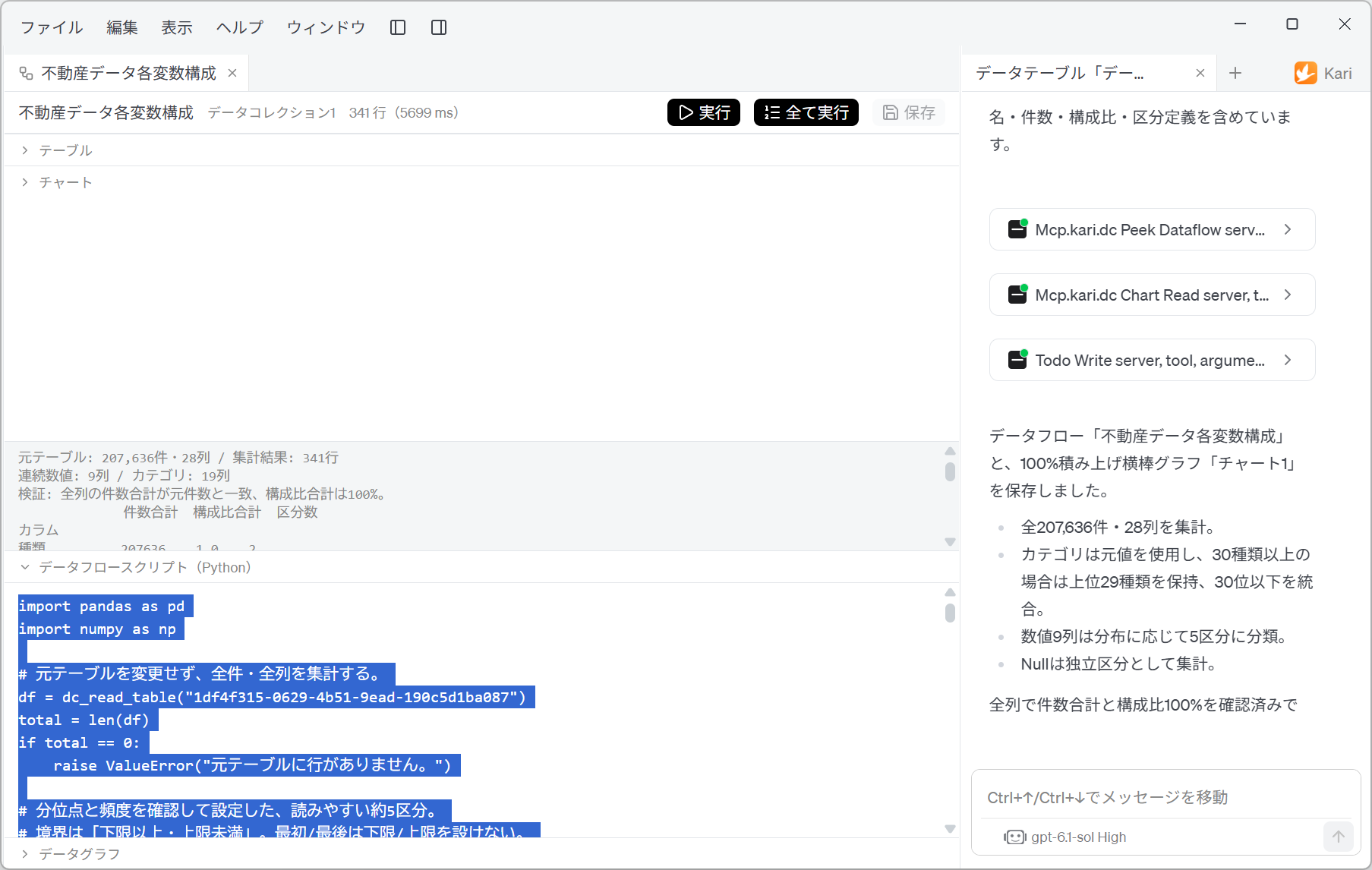
- Open Dataflow script (Python), and you can read the aggregation script the AI wrote exactly as it is.
Screenshot shown in the original Japanese.
The area above the script shows the verification results of the aggregation (rendered here in English).
Original Table: 207,636 records, 28 columns  /  Aggregated result: 341 rows
Continuous numeric: 9 columns  /  Category: 19 columns
Verification: record-count totals match the original count for every column; shares total 100%.
Next, a table with 「カラム」 (column), 「件数合計」 (count total), 「構成比合計」 (share total) and 「区分数」 (number of classes) is output, so you can check the verification result column by column. For 「種類」 (type) it is count total 207636, share total 1.0, number of classes 2. Here you can confirm, for each column, that the original record count is preserved and the shares come to exactly 100%.
import pandas as pd
import numpy as np

# 元テーブルを変更せず、全件・全列を集計する。
df = dc_read_table("1df4f315-0629-4b51-9ead-190c5d1ba087")
total = len(df)
if total == 0:
    raise ValueError("元テーブルに行がありません。")

# 分位点と頻度を確認して設定した、読みやすい約5区分。
# 境界は「下限以上・上限未満」。最初/最後は下限/上限を設けない。
The opening comment states explicitly, "without changing the original table" (「元テーブルを変更せず」). A Dataflow only reads the original Table; it does not rewrite it. You can redo the aggregation or change the conditions as often as you like without worrying about damaging the original data.
For the breakpoints too, the comments record that they are "about 5 readable classes, set after checking the quantiles and frequencies" and that "boundaries are lower bound inclusive, upper bound exclusive". Because the grounds for the breakpoints and the handling of boundaries are written in the code, a person can verify whether those decisions are sound.
- Open Data graph, and the flow of the data is shown as a diagram.
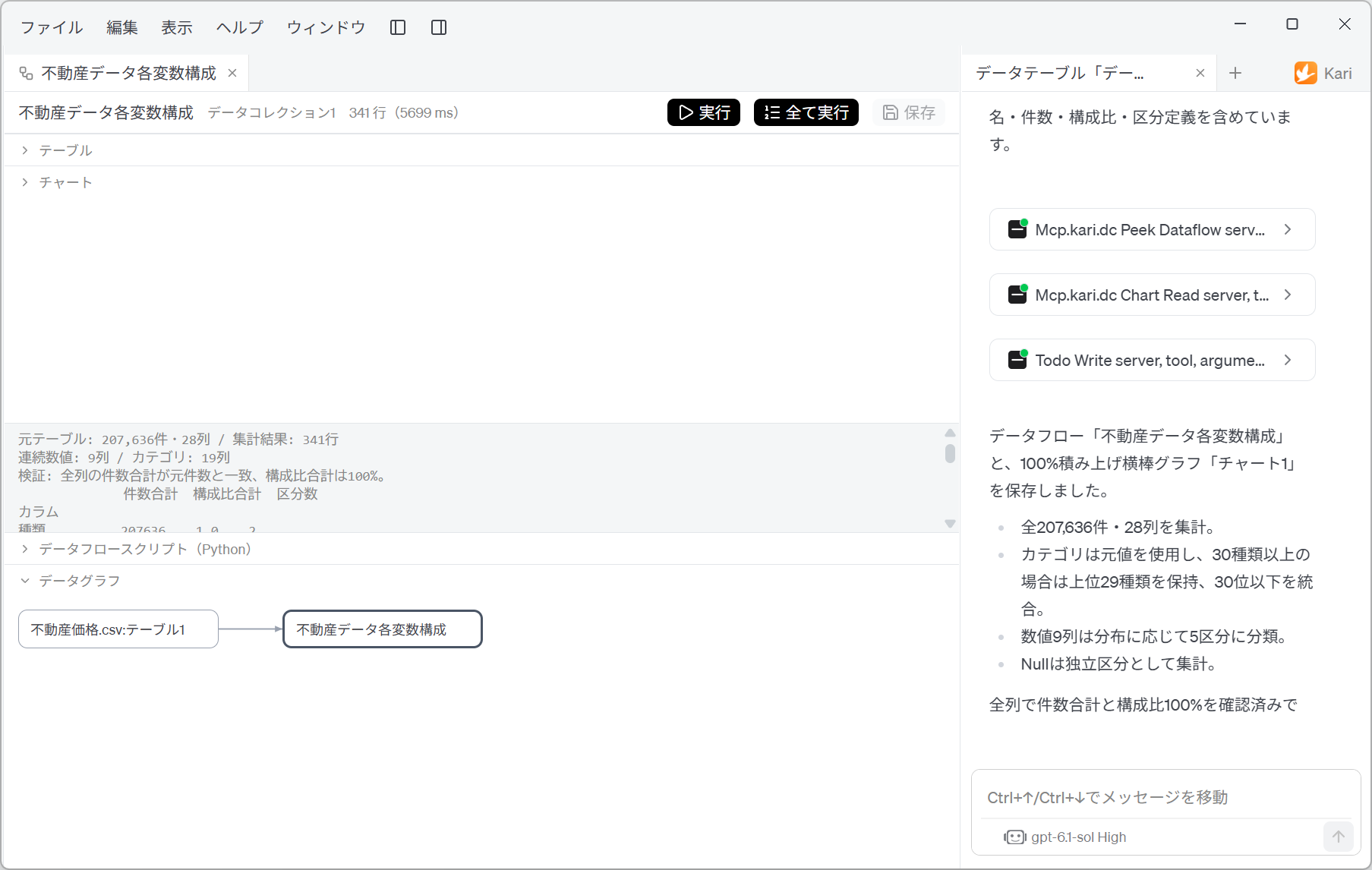
Screenshot shown in the original Japanese.
A single arrow is drawn from 不動産価格.csv:テーブル1 to 不動産データ各変数構成. Since you can follow in the diagram what was produced from which Table, you will not lose track of where an aggregated result came from, even as Dataflows multiply.
Human-in-the-loop points
Do not leave everything to the AI. Check the following yourself.
-
Check that the counts match the original
If the aggregation increased or decreased the record count, the aggregation itself is wrong. In this example the verification result "record-count totals match the original count for every column; shares total 100%" is shown, matching the original Table's 207,636 records. Check this display first. -
Tell whether a large band is "missing" or a "merged class"
Bands that take up a large area on the chart are of two kinds: the Null class, and the class grouping less frequent values. They look alike, so the chart alone cannot tell them apart. For bands such as the 85% in 「地区名」 (district name) and the 80% in 「最寄駅:名称」 (nearest station: name), always check which it is by looking at the 「区分」 (class) values in the aggregation table. The former is a problem of missing data, the latter a problem of class design, and they call for entirely different remedies. -
Check what is inside a class merged into "other"
In columns with more than 30 classes, the less frequent values have been grouped together. In columns such as 「地区名」 and 「最寄駅:名称」, what you want to analyze may be in the grouped side. Before making judgements based on a merged class, check its contents in the 「区分定義」 (class definition) of the aggregation table. -
Check the grounds for the numeric breakpoints
The boundaries of the 5 classes are ones the AI decided by looking at the distribution. They do not match breakpoints with business meaning (practical ones such as "50 million yen or more"). If you use them in a document, read the boundary values in the script and, if necessary, rewrite them and run it again. -
Separate out what Null means
Null can mean "not recorded in the original data" or "not applicable to that property". For columns with many missing values, such as 「地域」, 「間口」 and 「延床面積(㎡)」 in this example, go back to the specification of the original data and check which kind of Null it is. Treating the two as the same kind of missing value will mislead the analysis that follows. -
Drop constant and duplicate columns from the analysis
A column with a single value, such as 「都道府県名」, contributes nothing to the analysis. Columns whose contents duplicate each other, such as 「市区町村コード」 and 「市区町村名」, count twice if both are used. This chart is drawn precisely to find them. Reflect what you find in the choice of variables for the analysis that follows. -
Take figures to quote in documents from the aggregation table
Chart labels are rounded to whole numbers for readability (for example, 76% for 「種類」). The aggregation table keeps unrounded values such as0.7643761197480206. If you quote figures in a document, take them from the aggregation table under Table, not from the chart. -
A Dataflow does not change the original Table, but it can be overwritten
If you give an instruction again for a Dataflow of the same name, its aggregation is replaced. If you have adjusted the script by hand, keep a copy before giving the instruction.
How classes are cut and how categories are merged can vary with the LLM used. Even with the same instruction, the class boundaries can change from run to run. If you want to compare the results of several runs, rerun the same script.
References
The data aggregated on this page is the data from MLIT's Real Estate Information Library (「不動産情報ライブラリ」) retrieved and parsed on the previous pages. Screenshots are reproduced as quotations with the source stated. The aggregations, class definitions, Charts and scripts that the AI output were generated by GotoAI as an example of Kari's operation; they were not created or published by MLIT.
- Material: Real Estate Information Library, 「不動産価格(取引価格・成約価格)情報の検索・ダウンロード」 (search and download of real estate price (transaction price and closed-sale price) information)
- Provider: Ministry of Land, Infrastructure, Transport and Tourism (MLIT)
- URL: https://www.reinfolib.mlit.go.jp/realEstatePrices/
- Accessed: October 13, 2026
- Terms of use: In accordance with that site's terms of use. Source: MLIT website (URL above).
- The external information quoted on this site is provided to illustrate examples of using Kari. This site does not guarantee the accuracy or currency of that information. Quoted sources may be changed or removed without notice.
- The AI output shown on this site was actually obtained in the stated verification environment. However, this site does not guarantee the accuracy or usefulness of that output. AI output varies with the LLM used, its settings, and from one run to the next.
- The class definitions and breakpoint boundaries shown on this page were decided by the AI from the distribution of the original data; they are not officially defined classes.
- Check any aggregation script generated by the AI yourself before using it, at your own responsibility. If you aggregate with wrong class definitions, the results will be wrong.
- Screenshots were taken with the version of Kari current at the time of writing. The display may differ in your version.
- This page deals with actual real estate transaction price data. If you use it for purchase or investment decisions, always check it against the original data.
- The organizations quoted have no affiliation with, and do not endorse, this site or Kari.